How Bruno Sacco Transformed Mercedes-Benz
Bruno Sacco remains one of the industry’s most impactful designers nearly 25 years after his time at Mercedes-Benz ended. During his tenure, the company adapted to a changing industry, successfully pushed downmarket, and established an unmistakable familial look. Later on, it shook that formula up and challenged the idea of what a Mercedes could look like.
EARLY YEARS
Bruno Sacco was born in the town of Udine, Italy in 1933. His fascination with machines took root at the age of six when his father gifted him a model train. The young Sacco developed his artistic skills by copying drawings out of brochures. A career in the arts was all but certain, though it took him some time to figure out exactly what he wanted to do. He attended Antonio Zanon Technical College until 1951 and received a certification in surveying, but found that line of work unfulfilling. Sacco wouldn’t find his true calling until a chance encounter at the 1951 Turin Auto Show. An electric blue Studebaker Commander Regal called out to him. Years after this event, he likened the experience to being struck by lightning. Machines had been a lifelong passion of his, but it was at this moment that he decided to become a car designer.
Sacco earned an internship at Ghia in 1955 after training at Turin’s Technical University of Engineering Science. The young designer also did some work for Pininfarina in 1957. Although the city was becoming a mecca for automotive styling, Sacco had his sights on working abroad. More specifically, he wanted to be employed by Mercedes-Benz. According to a 1998 New York Times article, this desire was twofold. Their racing cars of 1954 and 1955 made quite an impression on him. He was also captivated by the 300SL Gullwing.
Securing a job in Germany would be no easy task, but Sacco had a plan. Mercedes was all but guaranteed to have a booth set up at the 1957 Turin Motor Show. He contacted the German consulate in the city to request an audience with Karl Wilfert, then the company's head of body development. From here, Sacco introduced himself and managed to get a second interview in Germany. He made a good enough impression to land a job in their bodywork department.
Sacco began working in their Sindelfingen design center on January 13, 1958. Fredrich Geiger led styling operations there. Paul Bracq, meanwhile, served as the company’s chief designer.
Sacco began working in their Sindelfingen design center on January 13, 1958. He was just the second designer that the company had brought on. The first, Paul Bracq, was hired in March of 1957. Sacco only anticipated staying in Germany for a few years, but these plans changed after he met his future wife and had a child with her.
Early on, he contributed to the W100-generation 600 and the W113-generation 230 SL Pagoda. While these were impressive projects to be involved in, Sacco believed that his way forward within the company was unclear. In an effort to advance his career, he left the styling section and took a position in the safety department under Bela Barenyi.
His days in automotive design were far from over. Safety became an increasingly important factor in vehicle development, and it would dictate styling and engineering trends for decades to come. A critical change came in late 1967. Paul Bracq left the company and returned to France. This opened up an opportunity for Sacco in the design department. Karl Wilfert believed that Sacco’s prior experience made him well-suited to head up the Experimental Safety Vehicle division. Sacco’s first major project in this new position would be the first in a series of highly influential concept cars.
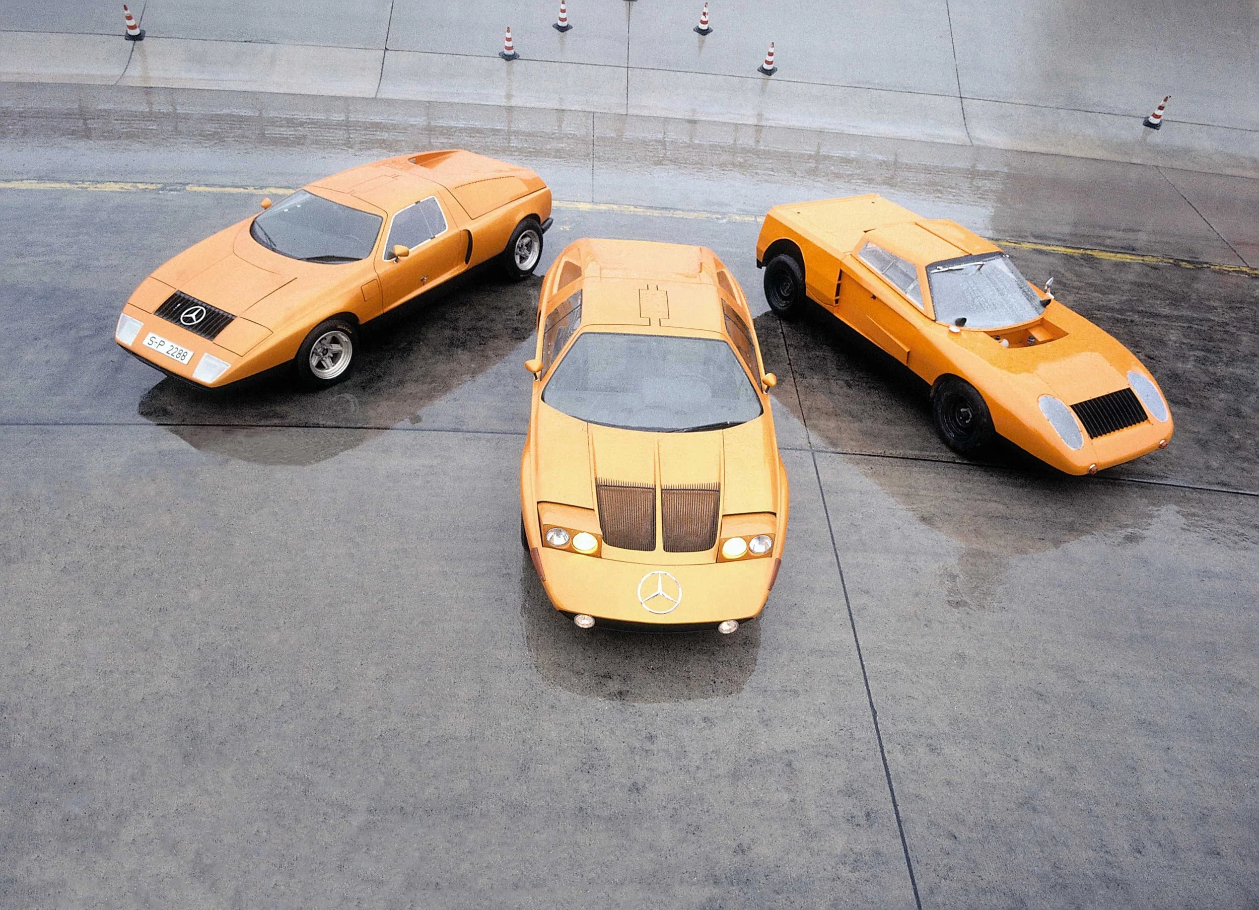
The C111 broke cover at the 1969 Frankfurt Motor Show. It was internally referred to as the C101 but this changed after Peugeot complained that it might be mistaken for one of its own cars. Mercedes, like many other automakers at the time, was exploring the viability of rotary engines. As such, the C111 is equipped with a 3-rotor Wankel unit that made 276 HP. It also featured a wedge-shaped fiberglass body and a striking orange paint job called Weissherbst. It referenced a popular type of wine.
The concepts presented here were refined and in March of 1970, they presented the C-111 II at Geneva. Redesigned bodywork provided greater visibility and contributed to an improved CD of .325, though its engine was arguably the most impressive part of the package. It had a new 350-horsepower 4-rotor engine that enabled a 0-60 time of 4.8 seconds as well as a top speed of 186 miles per hour. Patrons showed great interest in the car. Intrigued individuals presented the company with blank checks, though the C111 was never intended for production.
CLASSIC ERA
Bruno Sacco quickly ascended the Mercedes-Benz hierarchy. After his return to styling, he was named the head of the body and dimensional design department in 1970. Four years later, the company appointed him as chief engineer. Just a year after that, he succeeded Friedrich Geiger as the head of the Mercedes Styling Department. Design was already becoming an increasingly important consideration for the company. The department had come a long way since his hiring in the late 50s. By the time he assumed the top post, it was 130-strong.
Sacco had the manpower and resources to lay down a new design philosophy. For him, it wasn't enough to focus on one model at a time. While that approach would benefit an automaker in the short term, its long-term prospects would suffer. Creating one model with little regard for others in the range would result in a disjointed overall lineup. Likewise, designing the next generation of a vehicle without paying any mind to what came before it will weaken a company’s brand image.
To mitigate these issues, Bruno Sacco implemented two new principles. Horizontal homogeneity refers to the visual link between all models in a lineup. Vertical affinity refers to the connection that a new model shares with the old model. This would ensure that a Mercedes would always look like a Mercedes, regardless of its market positioning or model year.
Sacco would introduce these ideas at the very top of the range. The W126 S-Class, which had been in development since 1971, was set to be one of their most important products in recent memory. The automotive industry was experiencing a period of rapid change. Outright opulence needed to be balanced out with greater efficiency and more conservative styling. This new reality would not escape Germany’s most iconic saloon.
Compared to the outgoing W116, the W126 visually differentiated itself by eschewing the chrome bumper at the front. The one at the rear, meanwhile, is deemphasized and appears to be more integrated with the rest of the body.
The W126 also did away with the thin bumper guards. Panels lining the lower half of the body were set in their place. The so-called “Sacco Planks” might’ve caused a bit of controversy when they debuted on the car, but they’ve since endeared themselves to the Mercedes-Benz faithful.
Exterior styling on the whole was tidier and more streamlined than its predecessor. That car is certainly an elegant machine, but the W126 makes a powerful impression with its confidence and honesty rather than excess and flamboyance. Despite the numerous changes, it still maintains visual ties to the previous model. The overall grille treatment as well as the stepped lights at the rear are the most obvious links in this regard.
Most of the changes were more than skin deep. Reducing weight and increasing efficiency remained pertinent engineering considerations. Guntram Huber, then the head of body development, even claimed that they removed pieces of metal smaller than a fingernail. The book Bruno Sacco: Leading Mercedes-Benz Design by Nik Greene states that this was the first time that high-strength steels were used in a production saloon. These were 10 percent thinner than typical materials yet provided similar if not superior, structural strength.
8 cylinder engines continued to be on offer, though they were now made with an alloy construction as opposed to cast iron. Depending on the configuration, the W116 was between 59 and 280kg lighter than its predecessor. Its CD of .366 was also a 14 percent improvement over the previous generation. In terms of safety, the W126 carried over the antilock braking system from the W116, which gained it during the 1978 model year. Seat belt tensioners and driver’s side airbags also became available in 1981.
Sacco went from one end of the market to the other with the W201 190 in 1982. Although the compact executive served as a gateway model for the brand, it still had strong visual links to the original. The headlights, grille, and stepped lights are all indicative of the vertical affinity that Sacco emphasized. Instead, the smaller Mercedes differentiates itself primarily through its angular wedge-shaped proportions. The brand’s entry into this segment was a rousing success. By the time production ceased in 1993, Mercedes built 1.8 million of them. Sacco considered the 190 the most important car that he had a hand in while at the company.
Horizontal homogeneity was furthered with the introduction of the W124. Much of the exterior is a blend of what was initially established with its predecessors, though there were considerable changes around back. Much ado was made about the V-shaped trunk lid. It allowed for a high aerodynamic tail while also ensuring a low boot sill. This is in stark contrast to their other offerings at the time, where the boot opened at the top of the tail lights. The W124’s stablemates, as well as most other automakers, have since adopted this element.
Sacco’s understated and functional design language suited the sedans in their range, but would it translate to a more sporting car? The world would find out at the 1989 Geneva Motor Show with the unveiling of the R129 SL. It is instantly recognizable as a Mercedes, yet does enough with the formula to distinguish itself from the other cars.
Designers sought to emphasize the car’s width up front. By removing the vertical slats in the grille they were able to make the horizontal ones more visually impactful. The opening on the lower clip is also longer and more prominent than the ones on the sedans. Lastly, the thinner headlights help impart a more aggressive front-end signature. Like other cars, the rather rakish profile ends off with a raised rear deck, though, unlike the W124, the R129 did not adopt a V-shaped trunk opening.
Safety probably isn't the first thing that comes to mind when one thinks of convertibles, especially ones from the late 1980s. The R129 placed it at the forefront. A highlight in this regard was its self-deploying rollover bar. If the vehicle detected conditions evident of a rollover, then the bar would pop out in three-tenths of a second. It could also be manually raised if the driver chose to do so. This solution illustrated just how in-step design and engineering were for this project. An article from the website Driven to Write by Daniel O’Callaghan recalls an incident that occurred at the car’s launch event. A car went airborne and flipped over repeatedly. It was a mangled heap of its former self, but the driver and passenger were unharmed.
“With its classic proportions it was an automobile sculpture and the most perfect car of my career.”
Horizontal homogeneity influenced all of their existing cars and even helped them wade into uncharted territory. Vertical affinity would be put to the test in 1990 with the release of the W140 S-Class. It takes on a smoother, more modern form language that brings the brand into the 1990s.
It adopts a wedge profile that, while not as dramatic as the 190, still alters the car’s stance considerably. A more rounded front end transitions into a sloped hood. The third box, which is positioned at a higher point than the first, is angled ever so slightly. These changes give the luxury saloon a touch of energy and athleticism. Conversely, the W126 is orthogonal, boxy, and relatively level from end to end.
The grille has also gone through a number of changes. Less brightwork lines its perimeter and the old insert has been replaced with a more covert egg-crate pattern. Additionally, Mercedes removed the secondary logo at the top center. According to Sacco, this was a direction that the design department had favored for some time. He said:
“...(At some point, size had become a stumbling block–nevertheless) the car is very purist in terms of the way it handles surfaces and details. Little attention was paid at the time to the fact that we had removed the car’s showy radiator grille–a modification we had been seeking for a long time but which had never been accepted internally.”
It appeared that the styling and engineering teams were in complete harmony during this project. In reality, a rift had emerged between the design and engineering teams. Sacco said the following when reflecting on the endeavor.
“What I was originally aiming for was a shape that embodied aerodynamic efficiency, rather than outright opulence. Yet over the years, that brief changed, with W140s sheer size eventually evolving into a statement of blunt superiority.
I still see it every day and think to myself ‘That should have been 100mm lower in height,’ but as was often the case, I was overruled by the engineering department. I was even ‘semi-withdrawn’ from 140 projects due to my objections.”
In a 2006 interview with Motor Trend, he singled this car out as one that he was unhappy with. The reason? He felt it was four inches too tall.
THE NEXT GENERATION
Bruno Sacco had spent the late 70s, 80s, and early 90s refining the look of Mercedes-Benz. The rest of the decade would see the brand take its design language to new, daring heights. The first step in this direction came in 1993 in the form of the rather dryly-named Coupe Concept. It is a dramatic departure from the traditional Mercedes ethos.
No doubt the most significant change came with the headlights. Two circular units adorn the front of the car. While they might not communicate the sheer strength and power that the old mono piece lamps did, they do at least fit in with the concept’s more curvaceous surfacing. Similar lights showed up on the W210 E-Class. In referencing them in that application, Bruno Sacco said:
“When it comes to headlights it is better to set trends than to follow them… I believe the ‘eyes’ of the E-class were indeed revolutionary but they also preserved the identity of the Mercedes brand.”
The smaller grille still stands out because of the dark blue paint and the fact that there is hardly any other brightwork on the exterior. Mercedes also took liberties with its profile. An aggressively angled hood flows into a windshield with quite a bit of rake. The cabin doesn’t cut down to a defined third box. Instead, it stretches all the way back to the deck and gives it a fastback look. A rounded greenhouse and oblong lighting elements at the rear also play into this.
A year after the Coupe Concept debuted, Mercedes unveiled the SLK concept. Much like the 190, this model indicated the brand’s desire to break into a new segment. For evidence of this, look no further than the name. S is short for sportlich which L stands for leicht. K, or kurz, translates to Compact. It takes a more ornamental approach than the Coupe Concept. The grille utilized a bright metallic finish with numerous circular perforations. The pattern even carries down to the lower clip. Although some of the magic was lost in the transition to the production model, the concept did show that the brand was developing yet another design philosophy.
The 1996 F200 was another step in this direction. Its headlights look a bit more traditional than the ones on the coupe concept. Brightwork is used generously throughout and the car also utilizes a three-box architecture, much like their classic luxury coupes. Some features, such as the drive-by-wire joystick movement controls and scissor doors, remained on the auto salon floor. Others, such as the voice recognition and active suspension controls, would become available in the ensuing years. The F200 also previewed styling cues that would show up on a few of their production cars.
The idea of what a Mercedes looked like became more fluid between the mid-90s and early aughts. On the whole, their cars had smaller grilles, wedge profiles, and less brightwork. They appeared more svelte and athletic, though at the cost of their sheer presence at times. Designers had more freedom to give each model its own identity. A few of their cars lacked strong front signatures as a consequence. The C215 CL-Class, for instance, doesn’t quite have the presence that a car in its segment ought to have. Other elements, such as the pillarless windows and wraparound rear windscreen, help it make up some ground in this regard.
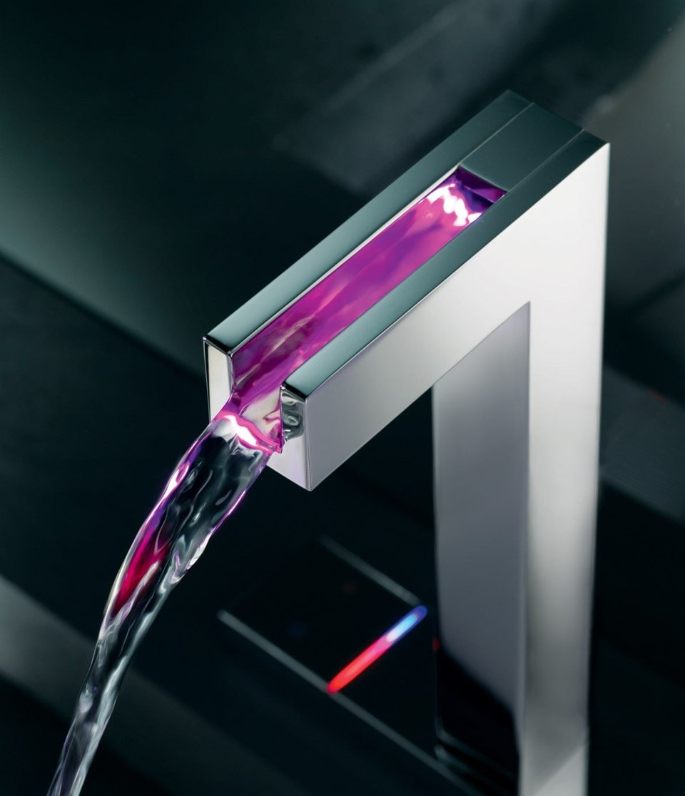
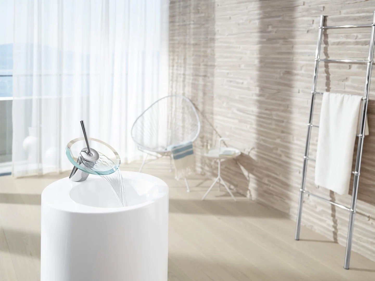
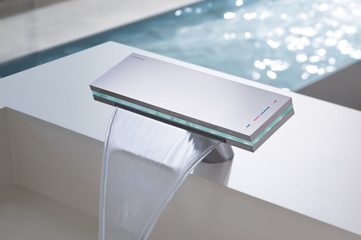
After a quarter century heading up Mercedes design, Bruno Sacco stepped away from his post in 1999. Other automakers tried to lure him into their studios, but he reportedly vowed to never design automobiles again. This didn’t mean that he was stepping away from the world of design, though. In 2001 he began collaborating with Reinhard Zetsche on a series of water fixtures for KWC Faucets.
They were released under the Hansa brand. The Latrava is a minimalist fixture that emits water in the form of a veil of sorts. The Canyon, meanwhile, has more of a resemblance to a typical faucet. Its name comes from a color-keyed light at the top of the spout that reflects the water’s current temperature. Going back to the other end of the scale again, the flow of liquid from the Murano looks to be inspired by a waterfall. Lastly, the Murano X earned Sacco a German Design Award in 2016.


Whereas others might shy away from change, Bruno Sacco embraces it. The former surveyor switched professions after laying eyes on a Loewy special. He then left his native Italy for unfamiliar land in the middle of the coachbuilding golden age. After a serious case of culture shock, he transferred to a different department, worked his way up the corporate ladder, returned to styling, and finally claimed the top position. Mercedes emerged from the malaise era no worse for wear and developed a strong design language. Rather than resting on its laurels, the company risked that identity by challenging the very idea of what a Mercedes could look like. Bruno Sacco is definitely an Industry Icon!


